Preview controls enable content editors to adjust some given context within the preview, without the need to edit the source content. Preview controls are fields that only affect the preview in the current context, and do not affect the source content or context for other editors.
This is useful in a number of scenarios, such as:
- User-context behavior, such as light/dark modes based on operating system preferences
- Editor-only insights, such as showing warnings for missing content
How preview controls work
Section titled “How preview controls work”Most features that customize the visual editing experience require a definition with Visual Editor configuration file. Preview controls are unique in that they are handled exclusively on the client side.
The injected JavaScript snippet looks for a stackbitPreviewControls object on the window object, as an array of individual control definitions.
These controls are then rendered in the proper context in Visual Editor. And when an editor changes the value of a control, the onChange callback is triggered, which can be used to update the preview in any way.
Control contexts
Section titled “Control contexts”There are two types of contexts for preview controls: global and field. These contexts determine where the control is rendered.
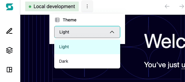
Global context
Section titled “Global context”The global context is rendered in the top bar of Visual Editor, available on all pages. This is useful for controls that affect the entire preview, such as a light/dark mode toggle.
Field context
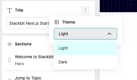
Section titled “Field context”The field context requires additional information and has multiple rendering locations. A content source and a document within that source must be specified. Without further details, the control is shown in the page editor, near the title of the document.
If a field path is provided, the control is rendered in the page editor, near the field.
Usage example
Section titled “Usage example”Here is a simple example to demonstrate how preview controls can be used.
Light/Dark toggle with React
Section titled “Light/Dark toggle with React”When working with a React framework, you can interact with the global window object through a useEffect hook. This also provides the ability to use TypeScript and ensure the control objects are properly defined.
This is a Next.js example that defines a theme control, which allows editors to toggle between light and dark mode, directly on the _app component.
//_app.tsimport type { PreviewControl } from '@stackbit/types'import { useEffect, useState } from 'react'import 'styles.css'
function MyApp({ Component, pageProps }) {  const [currentTheme, setCurrentTheme] = useState<'light' | 'dark'>('light')
  useEffect(() => {    if (typeof window === 'undefined') return
    const themeControl: PreviewControl = {      name: 'theme',      label: 'Theme',      context: 'global',      type: 'enum',      options: [        { value: 'light', label: 'Light' },        { value: 'dark', label: 'Dark' },      ],      required: true,      value: currentTheme,      onChange: (value) => {        console.log('theme changed to', value)        setCurrentTheme(value as 'light' | 'dark')      },    }
    const myWindow = window as any    myWindow.stackbitPreviewControls = [themeControl]
    return () => {      myWindow.stackbitPreviewControls = []    }  }, [currentTheme])
  return (    <div      style={{        backgroundColor: currentTheme === 'dark' ? '#444444' : '#ffffff',      }}    >      {/* ... */}    </div>  )}
export default MyAppDid you find this doc useful?
Your feedback helps us improve our docs.