Custom fields provide the ability to extend the default set of field types and controls available in the page and content editors.
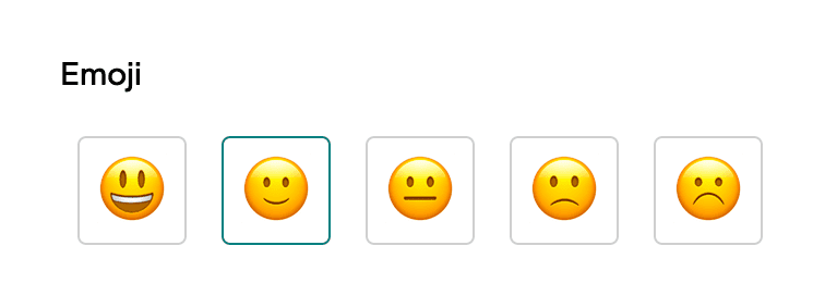
For example, suppose you want to add a field to the page editor that allows the user to select an emoji. Instead of creating an enum field and presenting emojis in a dropdown menu or thumbnail images, you can create a custom field type that renders the emojis directly.
Types of custom fields
Section titled “Types of custom fields”There are two types of custom fields:
- Inline Fields: Controls that are rendered directly in the form.
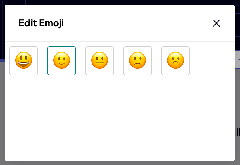
- Modal Fields: The form presents an “Open” button, from which a modal window opens with the custom control.
Inline fields
Section titled “Inline fields”Inline fields are rendered directly in the form. They are useful for simple controls that do not require a lot of space or that resemble standard form controls.
Modal fields
Section titled “Modal fields”Modal fields appear as an Open button within the form.
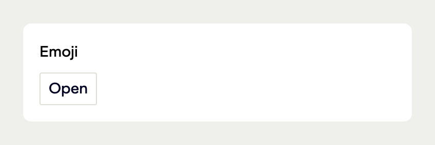
Clicking this button opens a modal in which the form control is rendered. Visual Editor automatically includes the label and functionality for closing the modal, although this can be customized.
These types of controls are useful for more complex controls that require more space or that would typically be used within a dialog window.
How custom fields work
Section titled “How custom fields work”Custom fields are built either as an HTML file or the JavaScript bundle and presented in Visual Editor through an iframe. They can bring their own styling and use JavaScript to hook into the editor and data flow.
Field types vs control types
Section titled “Field types vs control types”Custom fields can be defined against any Visual Editor field type by specifying the control type and a path to the HTML file.
The custom field should then set the value of the field to match the expected format of the field type.
// stackbit.config.tsimport { ObjectModel } from "@stackbit/types";
export const HeroSection: ObjectModel = {  name: "HeroSection",  type: "object",  fields: [    {      type: "string",      name: "title",      label: "Heading"    },    {      type: "string",      name: "emoji",      controlType: "custom-inline-html",      controlFilePath: ".stackbit/fields/emoji.html"    }  ]};
In the example above, the emoji field is defined as a string field type, but the controlType is set to custom-inline-html. This field is presented as an iframe using the contents of .stackbit/fields/emoji.html (relative to the project root).
See the configuration reference for usage of controlType and controlFilePath.
Hook into the editor
Section titled “Hook into the editor”When Visual Editor first loads, it looks for custom fields and injects a control.js script into the HTML file. This controls when the script defined in the HTML file (noted below) fires.
The HTML file should include a script that hooks into the editor’s data flow. When the field first appears, Visual Editor looks to call a global stackbit.onUpdate() function with an object of useful properties.
On the initial call, the init property is set to true, which can be used as a signal to attach event listeners to elements within the custom field.
Using the emoji example, each emoji could be presented as a button, and would update the field’s value when the button is clicked.
<script>  window.stackbit = window.stackbit || {};
window.stackbit.onUpdate = options => { if (options.init) { const buttons = document.querySelectorAll("button"); buttons.forEach(button => button.addEventListener("click", event => { // Update the field's value ... }) ); } };</script>See below for a more complete example.
Use JavaScript bundle
Section titled “Use JavaScript bundle”When controlType is set to either custom-inline-script or custom-modal-script, the visual editor expects that value of
controlFilePath is a link to the JavaScript bundle.
The visual editor will cache the code of the control, making it render faster. Also, React and ReactDOM is exposed within the iframe, which
decreases and optimizes the bundle size of the custom control.
Read more about controlFilePath.
Best practices
Section titled “Best practices”This section provides some common practices for working with custom fields, before moving on to an example.
HTML file location
Section titled “HTML file location”The HTML file can be placed anywhere in the project. Because Visual Editor plays no role in production, we recommend that this be placed in a directory that isn’t published to the web and that doesn’t interfere with your application.
In the examples shared in this doc, we’re using a .stackbit directory in the project root. This is typically where we recommend putting Visual Editor-specific files.
Add styles
Section titled “Add styles”In most cases, a custom field is going to want to bring its own style for an enhanced editing experience. The best way to do this is either to write styles directly in the HTML file or to link to an external CSS file. See the next section for an example.
Use external assets
Section titled “Use external assets”The HTML file can import CSS and JavaScript files from anywhere in the project repository. However, it’s often easiest to place it in the same directory as the HTML file.
<!DOCTYPE html><html lang="en">  <head>    <!-- ... -->    <link rel="stylesheet" href="emoji.css" />  </head>  <body>    <!-- ... -->
    <script src="emoji.js"></script>  </body></html>
Avoid public directories
Section titled “Avoid public directories”Because sites typically don’t use Visual Editor in production, we recommend that you avoid placing custom field files in directories that are published to the web.
While you could remove these files during the build, it’s best to avoid the risk of accidentally publishing them since there’s no benefit to doing so, and may be risky if the files contain sensitive information.
Emoji field example
Section titled “Emoji field example”This example shows how to create a custom emoji field on a hero component. The field enables editors to select from a set of five emojis. The stored values is a string of descriptive text representing the emoji. (This value would then be used to map to the emoji on the frontend.)
<!DOCTYPE html><html lang="en">  <head>    <meta charset="UTF-8" />    <meta name="viewport" content="width=device-width, initial-scale=1.0" />    <title>Emoji Field</title>    <link rel="stylesheet" href="emoji.css" />  </head>  <body>    <div class="grid">      <button data-value="grinning">😃</button>      <button data-value="slightly_smiling_face">🙂</button>      <button data-value="neutral_face">😐</button>      <button data-value="slightly_frowning_face">🙁</button>      <button data-value="frowning_face">☹️</button>    </div>
    <script src="emoji.js"></script>  </body></html>
body { max-width: 100%;}
button { font-size: 2rem; padding: 0.5rem; background: none; cursor: pointer; border: 1px solid #cfcfcf; border-radius: 0.25rem; line-height: 1; transition: background 0.3s ease;}
button.active { border-color: teal;}
button:hover { background: #efefef;}
.grid { display: flex; gap: 1rem;}// Safely initialize the stackbit objectwindow.stackbit = window.stackbit || {};
window.stackbit.onUpdate = options => { // Helper function to get the current value of the field. This is most useful // when a document has nested content fields. function getCurrentValue() { try { return options.fieldPath.reduce((acc, curr) => { const newValue = acc[curr]; if ("items" in newValue) return newValue.items; if ("fields" in newValue) return newValue.fields; return newValue; }, options.document.fields).value; } catch (err) { return; } }
// Use the init option to attach event listeners to elements within the custom // field. if (options.init) { const currentValue = getCurrentValue(); // Highlight the currently selected emoji if (currentValue) { document .querySelector(`button[data-value="${currentValue}"]`) .classList.add("active"); }
// Set the desired size of the control. options.setDesiredControlSize({ width: 350, height: 60 });
// Attach click event listeners to each button document.querySelectorAll("button").forEach(button => button.addEventListener("click", event => { const value = event.target.dataset.value; // Update the document in the content source with the selected value options .updateDocument({ operations: [ { opType: "set", fieldPath: options.fieldPath, modelField: options.modelField, field: { type: options.fieldModel?.type ?? "string", value } } ] }) // Highlight the selected emoji after content has been updated .then(() => { document .querySelectorAll("button") .forEach(button => button.classList.remove("active")); document .querySelector(`button[data-value="${value}"]`) .classList.add("active"); }) .catch(err => { console.error("Could not update emoji field", err); }); }) ); }};Emoji field React example
Section titled “Emoji field React example”This example shows how to create the same emoji component, but using React.
This control can be used when setting controlType to either custom-inline-script or custom-modal-script.
module.exports = {  entry: './index.tsx',  output: {    path: path.resolve(__dirname, 'dist'),    filename: 'index.js'  },
  // decrease bundle size by using React as external dependency  externals: {    react: 'React',    'react-dom': 'ReactDOM'  },  externalsType: 'global'};
body { max-width: 100%;}
button { font-size: 2rem; padding: 0.5rem; background: none; cursor: pointer; border: 1px solid #cfcfcf; border-radius: 0.25rem; line-height: 1; transition: background 0.3s ease;}
button.active { border-color: teal;}
button:hover { background: #efefef;}
.grid { display: flex; gap: 1rem;}import * as React from "react";import * as ReactDOM from "react-dom/client";
const Emojis = [ { name: "grinning", emoji: "😃" }, { name: "slightly_smiling_face", emoji: "🙂" }, { name: "neutral_face", emoji: "😐" }, { name: "slightly_frowning_face", emoji: "🙁" }, { name: "frowning_face", emoji: "☹️" }];
function Component() { const [value, setValue] = React.useState("");
React.useEffect(() => { // Safely initialize the stackbit object if (!window.stackbit) { window.stackbit = {}; }
const handler = (options) => { setValue(options.documentField?.value ?? "");
if (options.init) { // Set the desired size of the control. options.setDesiredControlSize({ width: 350, height: 60 }); } };
if (window.stackbit.options) { window.stackbit.options.setDesiredControlSize({ width: 100, height: 600 }); handler(window.stackbit.options); } window.stackbit.onUpdate = handler;
return () => { delete window.stackbit!.onUpdate; }; }, []);
return ( <div class="grid"> {Emojis.map(({ emoji, name }) => ( <button key={name} className={value === name ? "active" : ""} onClick={() => { const options = window.stackbit.options; if (!options) { return; } options.updateDocument({ operations: [ { opType: "set", fieldPath: options.fieldPath, modelField: options.modelField, field: { type: options.fieldModel?.type ?? "string", value } } ] }).catch((err) => { console.error("Could not update emoji field", err); }); }} > {emoji} </button> ))} </div> );}
const root = document.getElementById("root") ?? document.body;ReactDOM.createRoot(root).render(<Component />);Did you find this doc useful?
Your feedback helps us improve our docs.