Tidy up form fields into tabbed groups.
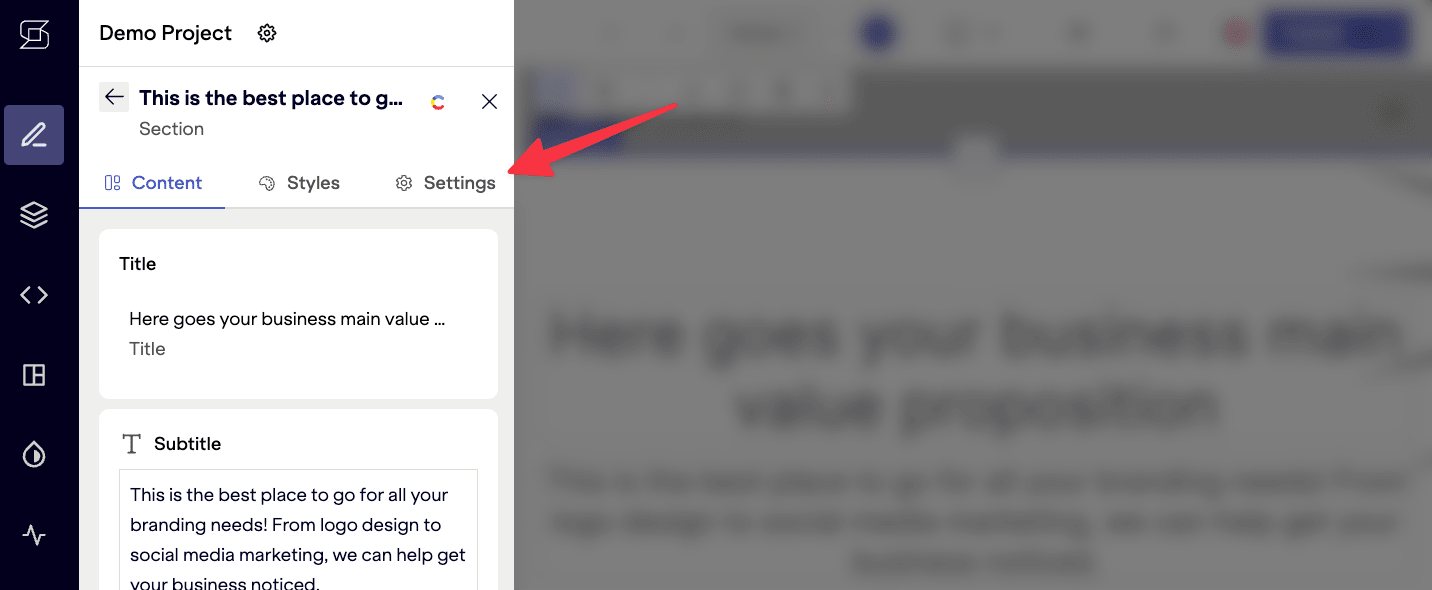
Groups are a great way to clean up the editing interface, especially when a model has a large number of fields.
Default field group
Section titled “Default field group”Every field is part of the Content field group by default, and the tabs are only shown if there is an additional group defined.
Fields that are to remain in the Content group do not need to be extended. You only have to configure those which you wish to move into a custom group.
Customize field groups
Section titled “Customize field groups”Field groups get adding by extending a model with the fieldGroups property, and then specifying the group for the appropriate field.
Use icons
Section titled “Use icons”There is a select set of icons available to use for each tab in the group, if you choose. This list is available in our reference docs.
Example: add styles group
Section titled “Example: add styles group”Here’s an example that adds a styles field group to a hero model, and then places a bgColor field within that group.
// stackbit.config.tsimport { defineStackbitConfig } from "@stackbit/types";
export default defineStackbitConfig({  stackbitVersion: "~0.6.0",  modelExtensions: [    {      name: "hero",      fieldGroups: [{ name: "styles", label: "Styles", icon: "palette" }],      fields: [{ name: "bgColor", group: "styles" }]    }  ]});
The result would show Content and Styles tabs, similar to the image at the top of this document.
Did you find this doc useful?
Your feedback helps us improve our docs.